Showing posts with label design. Show all posts

Monday, October 26, 2015

Form Ever Follows Function


My tardiness in writing a well-thought out newsletter was delayed due to book* & presentation projects earlier this month.

I've been leading an Art Deco skyscrapers walking tour,  primarily along LaSalle Street in Chicago,  since I 'certified' in late spring. Art Deco is about ornamentation, these magnificent 1930s skyscrapers got me thinking about structure and the use of ornament (decoration).

Below is a quote excerpt from Holabird & Roche, architects of Chicago Board of Trade (1930):
"the exterior is an expression of the function(s) of the building..."
I think they were tapping into Louis H. Sullivan's "form ever follows function." For the CBOT, many would agree, the ornamentation is not merely decoration; it accentuating the overall design of the commodities exchange–all relating to agriculture (wheat, corn, lumber).

Why the architecture metaphor?
Frankly, there are numerous metaphors beyond architecture.
Each project, even an image for your Instagram feed requires structure and planning. We must invest the time into purpose or function, before any discussion of ornamentation. Then the mechanics of structure structure and flow of the publication will designed. Every writer I know begins with an outline or structure. Yes, even graphic designers begin with function and structure.

No amount of stock images, cheeky infographics or trendy color swatches will hide the lack of thought given to crafting a strong message and story structure; including any call-to-actions.

Working with photographic material presents a different opportunity to create a theme or visual structure for a collection. (see previous post)

I can't tell you how many times, I've been asked to work on pitch deck/publication and the first conversation is about the aesthetics versus purpose, theme, content and audience.

Let's not design from the outside inward. Sticky notes, index cards or whiteboards are simple, yet effective tools to breakdown your storyboard, eliminating the non-essential, shifting sections to improve the flow, etc.

More about structure or storyboarding:


Break out your coloring pencils to ignite your inner creative juices–coloring is the new meditation. Patterns of the Ancient World and Renaissance Patterns were developed for convenience of travel. The 6x9" size is ideal to toss in your shoulder bag and fits nicely on hard surface like your tablet. AND, I included blank pages for your own drawings or doodles. Available via Amazon.

Joann

Thursday, June 12, 2014

New Technology + Existing Market = New Pitch Deck

The past two months have been a whirlwind of activity, pushing my monthly newsletter to the back burner.  As a marketer, we all know this is a bad habit. However, focusing on successful results for client projects is a good thing.
Since early April, I’ve been immersed in several publishing projects: annual reports (2), software user’s manual, pitch decks (2 or 3), conference program, marketing brochures and simple webpages.

Today, I’d like to share a success story.
New energy technology start-up, GasTechno Energy and Fuels, hit the road in May to meet with prospective investors. Then, immediately back at the airport for an oil/gas industry event. Both required presentations and at a minimum a fact sheet.

After years of “start-up” mode, GasTechno was ready to take a more aggressive lead with its marketing. Conversations with the CEO, as the private placement was nearing completion, were about a fresh/modern design to wrap around the key message(s).

Despite the 30-slide deck, the client was rigorous with copy editing; choosing words/phrases carefully, even whittling the amount of data being presented. The use of infographics and strong visuals supported the core message.

The result was a deck that has proven itself to be great companion to the overall presentation, a successful first round of investments.


Immediately thereafter, the CEO headed to a gas/energy conference for meetings with a different audience (energy company analysts and engineers). We pulled several slides from the investor deck and updated slides from an existing presentation. A thorough “going over” to ensure overall design consistency was needed...all under very tight deadline.

The result for this hybrid deck was highly receptive. Contracts [close to being] signed and GasTechno has been awarded funds from new technology grants on state and national levels.

Congratulations to GasTechno Energy and Fuels, especially Walt and the opportunity to part of the company’s new launch this year. Much continued success!

Thursday, March 13, 2014

Six Keys for a Successful Presentation or Dye Your River Green

What's more "Chicago" than a bright green river and a parade, all on the same day! As St. Patty's Day is just a few day away, Chicagoans will be in celebration mode all weekend. I forgot to check the city's event calendar and scheduled myself for an architecture tour this Saturday; needless to say I'll be navigating the party-goers. 

Tapping into resources like Presentation Zen for guidance and "how to" advice to develop a remarkable presentation can be very helpful. Possibly elevating your presentation to the next level; maybe even close the deal on the spot. Leverage your presentation (and speech) for professional success and personal fulfillment with these six key elements.


Story: The Narrative Imaging. Everyone has a story to tell. All of us will listen to a story. The best storytellers are those who input their own personality, character and experiences into the material in a form of narrative. Yes, even business presentations can have a personality; it should be the company's personality.

Design: More than Decoration. Developing the design of the presentation should come after the storyboarding (outline) stage. Colors, graphics, images, fonts and charts/tables should add visual emphasis to the content. Not just mere ornamentation. The visual theme should be regarded as part of the overall messaging process.

The Big Picture. When you look through the view finder of your camera, you see the larger view. Look some more and you'll begin to focus on the details. What's important? What matters? Focus on the key message.

Empathy: Be Human. Can you add emotion to your presentation + speech? The best stories are those that grab our emotions. Look for non-verbal cues to add emphasis.


Play: Be Willing to Laugh at Yourself. This can be tricky, because telling joke can backfire. Being authentic (aka human) can build a real connection with your audience and keep them interested.

Meaning: Where's Your "Why". Where's the passion? Have you given this presentation + speech so many times that your enthusiasm is waning? Go back to the Big Picture and ask yourself "why?" (Hat tip to Simon Sinek)

Do you attend professional networking events? Or, pitch nights? How many times have you pulled out your smartphone and began checking your emails or catching up on headlines because you lost interest? 

There's a lesson for all of us. 

The core of my creative services is working with professionals to improve their presentations. I offer a free review of your existing presentation and an evaluation with recommendations. 

Tuesday, December 3, 2013

Secrets of Self-Publishing Presentation December 19th

Are you an aspiring author looking for a publisher? 

Look no further than the closest mirror! 

I will be leading a class and discuss to help you simplify the self-publishing system, whether you’re excited about e-books or hard-nosed about hard copies. 

You’ll learn about a wide variety of author services, DIY tools and creative platforms while deciding which method of print and distribution fits your circulation aspirations. And the best part is, you’ll love who you’re working with: yourself!

This free class will be held at one of the community classrooms at Next Door Cafe in Chicago. We'll begin at 6:30p and I'm planning on leaving enough time for Q&A. Next Door Cafe is located at 659 West Diversey. 

In case you can't make this live event, I have prepared an, Self Publishing: Navigating the Process; loaded with description of service providers, tools and pages of resources. 

Available for viewing/downloading via Slideshare.


Thursday, September 26, 2013

Repackage. Repurpose. Publish.

REPACKAGE. REPURPOSE. PUBLISH.

  • Are you consistently writing blog posts or articles about your industry?
  • Is your marketing kit filled with thought-leadership pieces?
  • Are you called upon as a 'expert' to address professional audiences?
  • Are you using a self-authored book as a key marketing tool?

A self-authored book/ebook as an instrument in your marketing strategy is as old as the hills. People have been doing it for centuries. Today is the day to turn your big pile of content into your own book.
Create. Collaborate. Publish!

In today's 'always connected' digital world, your business book serves as a platform for your ideas and expertise; building on the foundation that you are already a thought-leader in your industry. Use a book or ebook to assist with relationship building of influencers, media and higher-level clientele.


Repackage. Repurpose. Publish.

Sit down, spend the time to review all the articles or blog posts that are stored on your computer or web server. Do you notice a theme?

Let's work together with an editor to organize your articles and construct a book. Freshen up content, double checking facts and sources, adding imagery to enhance the key ideas, crafting a new introduction... and you are on your way to being a self-published author.


Create. Collaborate. Publish!

Production and distribution is now available to everyone. Period. Delivery and distribution to mobile devices has never been easier. The millions, tens-of-millions of smart devices in use today dramatically broadens your reach.

There's no need to order thousands of printed books and store them in your basement. Order what you need for promotional purposes, keeping out-of-pocket expenses within your budget.


Are you ready to publish your ebook? 

Visit the Creative Aces portfolio to learn more about publishing to the iPad or tablet.

Wednesday, August 28, 2013

"Movement" Free PPT Template (August 2013)


I'm looking across my desk right now and imaging sweeping my arm across the top; all the papers, business cards, sticky notes, slides and magazine articles falling eloquently into the recycle bin.  Of course, I'd be lost on Tuesday when I return after the Labor Day weekend. 
Inspired by the movement of the steel ribbons of Pritzker Pavilion, designed by Frank Gehry, this month's Powerpoint template injects some energy and movement into your presentation. The color scheme is reflective of the reflections that surround you when walking through Millennium Park.

Free download via Slideshare.

Just a reminder, that my Powerpoint templates are wrapped around the 12-slide structure "Universal Pitch Deck." The ebook is available, here.


Thursday, June 27, 2013

How to Use Right-facing Pages to Your Advantage

This year’s Printers Row Lit Fest was an opportunity to talk with several self publishing entrepreneurs or authors/artists. Bravo to all who have made this journey!


We bought books from two indie/self publishers at the Lit Fest; both books are image intensive. One photographic the other illustrative. However, one noticeable difference was the placement of (single) page images.


The book designer of the illustrative book failed to recognize that the artist’s illustrations should have been on right-facing page.


The right-facing page in ANY [printed] book or publication is the most valuable space. Our eye is naturally drawn to the right-facing page. Turn the page of a book or magazine, the physical action of turning the page reveals the right-facing page first. (Except for some cultures who’s written orientation may be different.)


Using the right-facing page to your advantage
Exhibit A: Image on left.

The illustrated book failed to create a proper title page for each section; placing the illustrations on left-facing page with no designated chapter page. The artist’s illustrations the showcase of the book.


In contrast to the coffee-table book which created a spread. Using both left and right pages to designate a new chapter.
Exhibit B: Shift the image to the right.
The noted difference between these two book designers is a designer who clearly understands foundational strategies to creating a reader-centric experience.


Exhibit C: Ideal page spread introducing a chapter or section

Thursday, June 6, 2013

"Art Deco" Free PPT Template

In celebration of the Century of Progress Exposition which opened May 27, 1933 in Chicago which has come to symbolize the future of our country in the midst of global economic and political turmoil. 

This FREE Powerpoint template celebrates the bright colors and geometric shapes popular during the 1930s.


Art Deco can be interpreted as the 'bridge' between the hand craftsmanship of the early 20th century and the mass production of the machine age following World War II.  The juxtaposition of rectilinear and geometric shapes alongside highly stylized forms of nature remains fresh and bold.  Chicago's abundant art deco buildings continues to amaze: Chicago Board of Trade, Bank of America (Field Bldg), Palmolive (Playboy), 333 North Michigan Ave and many more. 


Monday, May 6, 2013

Stock Images: A Double Edge Sword


Last week I received the following pieces of mail: a über large postcard for hearing devices and the neighborhood coupon booklet. Each of these arrived the same day. 


Take a look at the handsome couple. The same two people! My neighbors in the elevator must have thought I was nuts listening to me laugh. 

What are the chances that a designer would select the SAME couple for their layout and those unrelated pieces of direct mail would land in my mailbox on the SAME day?

I use stock photos and illustrations for my clients, I do prefer custom photography but most of the time the budget just doesn't allow me to hire a professional photographer or illustrator.  I dig deep into a search, using key words appropriate for the project/message and attempt to avoid the most popular or downloaded images.

How do you handle your image searches to avoid this situation?

Monday, April 22, 2013

Lilacs Are Blooming! Free PPT Template

Happy Earth Day!

Lilac shrubs lined the perimeter of the backyard of my childhood home. The lilacs were the envy and delight of our neighbors during the springtime. Large bouquets would adore our house. And we would gladly share with neighborhood ladies on Mother's Day.  That seemed so long ago.

Today, I enjoy the lilac shrubs (trees) in Lincoln Park. Unfortunately, I can't cut any and bring them home but I can stop to enjoy their aroma. 

Thus was the inspiration for this month's {free} presentation template. 

Monday, April 15, 2013

Cover Design: Why It Matters.

Mon. April 15, 2013 Update: I saw this article from New York Times "T" Magazine, with "an illuminating cross section of 83 years of book design" for F. Scott Fitzgerald's "The Great Gatsby."  

____________________________

We DO judge a book by its cover. 

Sad, but true.

The cover is an invitation to "enter" the publication.

The most important sales tool at your disposal is the cover of your book (ebook, white paper, presentation, annual report). Make it noteworthy! 

Your cover design should be approached with the same mindset used by product marketing and creative teams. Product packaging drives purchasing decisions for the thousands of products on the market. A book is a product. The cover will be judged as an indication of the quality of the content.

Good, think GREAT, cover design will make you linger, soaking up the imagery, type and layout. You may even run you hand slowly across the cover. Even in our digital world, pausing ever so slightly to enjoy a cover design and when interactivity is added... it's still tactile. 

While cover design varies from business-to-business (B2B) versus consumer (B2C); the end result is still the same. It MOTIVATES.

Check out Chip Kidd's TED Talk "Designing books is no laughing matter. OK. It is."

Below are a few guidelines that can help differentiate your cover.

  • Kindle Interest: The cover is the reaction to "tell me more." It's the invitation to enter, learn more, travel to new places, explore ideas, etc. Good cover design requires research and study. Testing structure, placement of elements, image selections, fonts and color palette. 
  • Identifies With Your Audience: Understanding your target audience and sharing that profile with your designer is imperative. Your designer will develop concepts that should appeal to your audience.
  • Visual Overview: Is the cover a reflection of the theme? It doesn't matter if we're selling our company's features and/or benefits or telling a fictional story; the cover of the publication should be a visual overview.
  • Convey An Idea (Emotion): The cover should be more than an afterthought to package the contents. It should be the forethought. Sparking the motivation to turn the cover is how we get to the "tell me more" motivation.
  • Make It "Top Drawer": The accessibility to do-it-yourself is everywhere and we recognize the work of a true professional. As a minimum, invest in a professionally designed cover. After all... it will be your primary marketing tool for your book or publication.


Reference links:

Creative Blog 10 Imaginative Annual Report Designs
http://www.creativebloq.com/graphic-design/annual-report-design-2131905

New York Times Favorite Cover Design of 2012
http://www.nytimes.com/slideshow/2012/12/19/books/20favorite-book-covers.html

Wednesday, March 6, 2013

Spring Clean Your Presentations :: Free Template


The weather report is forecasting nine inches of snow for Chicago, I hope you'll be spared.  Regardless, Spring is just around the corner and there's no better time to clean up your presentation and/or marketing materials. This month's free presentation template is just the cure!

Quick fix solutions to improve your presentation:
  • Remove/reduce the affects applied to type.
  • Don't overwork the type with colors, and AVOID WORD ART.
  • Select bullet symbols and keep it neat, avoiding picture-based bullets.
  • Reduce the amount of text on every slide, the focus is your speech.
  • Purchase quality stock images that represent your brand/company and build your own library.
  • Graphics should fill the screen, not be a postage stamp.
  • Simplify charts/graphs to essential data, building a series, if needed, to emphasize a complex idea.
Remember, they came to hear/see YOU speak, not have the slides read to them. This also applies to web-based presentations. The presentation is the backdrop to re-enforce your message. Offer to give or send a whitepaper, e-book or marketing kit in your followup.

Free Powerpoint template, available for download and immediate use.


Monday, January 14, 2013

Quality Trumps Quantity

Welcome to the New Year!

Scripting a speech is hard work. 
My compliments all the writers I know who craft content for {numerous} presentations and speeches. 

I’m currently working on a 5-7 minute Toastmasters’ speech to be delivered at our next meeting. During early practice sessions, I was so hung up on trying to tell EVERYTHING I knew about my subject. It wasn’t working and lacked enthusiasm.

Cut, Cut Some More
I made the decision to cut major portions of my speech, eliminating the statistics my audience could find on Wikipedia. Focusing my attention on telling a story... the backstories, anecdotes and complementary stories that add deeper meaning.  

Soaring Heights and Stopwatches
My subject is the Willis Tower (originally Sears Tower) -- an imposing topic for anyone. But, as a docent, I knew I could weave the essential information into interesting stories to keep my audience engaged. I didn’t want to waste precious minutes reciting extensive statistics. 

Quality Trumps Quantity
I chose to put together a brief fact sheet as a handout. (BTW, we meet in Willis Tower, so my overall presentation requires a special touch.) Once I decided to curate some of the information, the stories came to together, naturally. A stronger and hopefully more interesting speech with less “text.”

“I’m redesigning my website and it will have “lots of copy.” I’ve heard this repeatedly the past few months. Using massive amounts of text/copy to improve search engine optimization is a misconception. It’s like pressing the elevator button repeatedly, hoping the doors will close before your boss steps forward.

Focus on the quality of your content and how it relates to the overall keyword strategy of/for your website or article. 

It’s time to escort the myth about using more text (quantity) directly out the door.

Thursday, October 25, 2012

Brainstorm With A Teenager For New Insights

My apartment is filled with images captured by husband, Dominic R. Sondy. A lifetime of creativity on film, slides, transparencies, 4x5s, prints and digital files; all stored in archival quality sleeves, bins, DVDs and USB devices.  And he continues to create more everyday.

We began curating collections and publishing books, beginning with “Saigon Shuffle” his Vietnam experience covering his assignment at the front and then as a military correspondent covering Asia.
Since then, I’ve always tried to look for opportunities to extend the products available for each collection.
For The Trees #19 Poster

One of his most recent, “Can’t See The Forest For The Trees” is pure imagery. An esoteric look at the oddities on trees in Chicago’s Lincoln Park. Think inkblot meets horticulture. Naturally, individual prints are available, over 100!. But I was looking for opportunities to extend the product line not only for “Can’t See The Forest For The Trees” (“FTT”) but also for other collections.
 
Publication of the FTT book took several iterations to get the quality just right. Working with image rich content requires higher standards than just “ink on paper”. Everything from size of book, image wrap vs soft/hard cover, paper selection and print quality were examined carefully.  

While reviewing one of the early editions, my youngest daughter started flipping through the pages and free-styling ideas for products.

 Posters! iPhone/iPad cases! Calendars! Oh, my!

For The Treest #093
Productions of calendars was already on my list, but I hadn’t thought about posters and skins for devices. I started to listen intently to my fourteen year old who was selecting images for these products. “
Mom, this one would be great for a poster. I’d put this up on my wall.”  “Imagine this one on my iPhone staring at you.”  
I went to work creating the products and building the landing page for the “Can’t See The Forest Through The Trees” product offering.

We were doing the victory dance last night when I blurted out to my daughter that we sold one of the posters!  

My New ‘Youth-Oriented’ Focus Group
Sometimes I get so stuck in my own, old, conventional methods that I fail to realize that my audience may be much different.  It took the off-the-cuff suggestions of a daughter reviewing her father’s work to add new thinking to marketing and product creation. In addition to the product suggestions, she went further, hinting at a pricing structure for each product and poster size. In other words, what she would be willing to pay to hang a poster in her room.

Since my daughters are part of Dominic’s and my social streams and their friends tap into their streams, that presents an opportunity to connect with new markets that I hadn’t seriously considered. I’ll be looking forward to another serendipitous focus group session with my (smart and insightful) teenage daughter.

Tuesday, October 18, 2011

Design. Digitize. Distribute.

10.18.11 Update: I recently learned PDFs are, and have been since 2001, indexed by Google.

I'm interested in how businesses can distribute and share their documents & publications across various platforms, versus keeping a monthly newsletter trapped in its PDF filing cabinet or parked in an email. We're now able to publish on platforms that are accessible to our audience regardless of device.

Additional products/services will be rolled out over the next few weeks, too.   As a designer who enjoys the convergence of text + imagery, I've been concerned about quality on your monitor, smart phone or tablet; but I think that argument is mostly extinguished as technology improves every day.

Creative Aces' Digital Publishing Services is on online publishing, viewer and analytical platform powered by Issuu. The features offered at PRO level have the potential to increase readership and feedback from your own list plus Issuu's 33 Million monthly readers. As we begin to bridge the desktop-to-tablet technology, additional features of this platform include:
  • Customize the viewer with logo, icons, colors, animations
  • Remove the advertising sidebar on embedded and standalone publications
  • Newsstand/library to display and monetize your publications
  • Organize documents and distribute your content
  • Bulk upload for uploading hundreds of publications
  • Auto-embedding to automatically embed latest edition
  • Detailed statistics and reporting
  • Search Engine Optimization (SEO) and high Google ranking
  • Active links to websites, email links and advertisers
  • Add audio/video to your documents or presentation
We can get the process started with previously published documents and begin building a library of materials outside of the corporate server or a "jump drive."

Here's a just a few ideas: Investment profile or white paper, quarterly earnings presentation, sales presentation, annual report, monthly newsletter, portfolio, "look" book, etc. in which we could build a direct marketing campaign and track the results.

Joann

Tuesday, October 4, 2011

Earnings Season Begins. Still Using The Same Presentation?

Recently, I was brought in to assist a company update the design of their investor presentation to reflect current marketing synergies and investment story.

Turns out that the presentation currently in use is one that I had designed about 3-4 years ago. Has the investment story changed in the past quarter? Previous twelve months?

It's time to update.

Thursday, August 4, 2011

My Pet Peeves of DIY White Paper & eBook Design

Design matters. Especially when the company name and reputation are involved. A well-designed white paper has the potential to elevate the “importance” of the content. Admittedly, don’t we all place 'value' on the appearance and attention to detail in the items we buy.

By nature of my profession, I view a lot of documents as sources for inspiration, trends, information and fun. However, as the explosion of Information Marketing is taking the web by storm; I’m noticing more DIY or off-the-shelf document formatting.

Design matters, a lot!

Below are just a few peeves that distract from the readability and ultimately, the value of a white paper or e-book. (I have purposely excluded samples from this article because I don't want to embarrass anyone, including myself.)

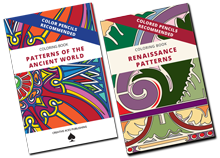
Peeve: Frumpy, Dumpy CoversCreating a compelling “tell me more” cover is an art and skill. I typically reserve finalizing the cover until the interior is complete. If you’ve ever taken a small child grocery shopping, you’ll understand why he/she picks up certain (high priced brand) boxes off the shelves while ignoring others.

Fix-it Tip: There isn’t a quick fix tip for designing covers. In my opinion, one of the most challenging aspects of the project.

Peeve: Text That Hurts My EyesThis is one of my biggest frustrations. I give a company my email address to receive their ebook and I can’t get past the first few pages because the font and paragraph styling is best suited for a birthday card. As a reader, we tend to scan groups of words when reading and anything that creates a barrier to this process erodes the value of your content.

Fix-it Tip: Use serif typefaces for body copy. The finishing strokes or serifs on typefaces like Times New Roman and Garamond aid the eye as we move from word-to-word.

Fix-it Tip: Add extra line space. The default ‘single’ line spacing is not the best choice since it tends to make the lines of text too tight. The addition of some white space between lines guides the reader left-to-right.

Fix-it Tip: Avoid long lines of text by increasing left and/or right margins or adopting a multi-column format. Could you imaging reading an article in the New York Times that was a single column of nearly 23” wide? Eye strain!

Peeve: Lack of Visual Cadence
Documents of continuous blocks of copy without headlines, sub headlines, call-out boxes, and even bullet points are just plain boring. Let’s be perfectly honest; you’re skimming this entry right now trying to glean the best stuff. The goal is to increase readability & readership.


Fix-it Tip: Use subheads, formatted with a complementary font and color.

Fix-it Tip: Add white space between ideas or sections.

Peeve: Disordered Page Layout
Rag-tag, zip-zagging content is ugly. Ugly to look at and easy to dismiss. A call-out box here. Chart inserted there. Close file. Total waste of my time.


Fix-it Tip: Using a multi-column format can provide the containers for text and other elements to be placed efficiently and neatly.

Peeve: Blatant Disregard for DetailsRunning spell check is easy, but actually printing a hard copy and reading your own white paper is a big payoff in catching small details. Here are a couple more:
Fix-it Tip: Two spaces at the end of a sentence is very old school. Consult today’s style guides.

Fix-it Tip: Fix awkward line breaks on formal names, dates, locations and numbers by keeping on same line.

Fix-it Tip: Stop using the Return key to add unnecessary extra line spacing between paragraphs. Use paragraph styling instead to automatically format paragraphs with approx. 1 ½ lines of text between paragraphs.

Peeve: Using Every Color AvailableI was trying to read an online magazine today, but couldn’t get past the first few pages because the ‘production artist’ was using just about every color of the spectrum more suitable for a birthday card. An experienced publication designer will establish a color theme, rendering editorial content consistent; thus emphasizing images, charts and adverts.

Fix-It Tip: Stop the overuse of color by developing a limited color palette. A less is more mentality is needed.

Peeve: Ignoring StylingFormatting text as you go is inefficient and amateurish. Even MS Word has the ability to create styles for text and paragraphs.

Fix-It Tip: Select typefaces and attributes once and apply consistently throughout the document.

Wednesday, January 26, 2011

How Do You Conquer "Creative Frustration"?

I've been working a logo project all morning and making little progress toward anything I'd like to share with the client.

This is the second logo project in less than a week. I'm not complaining. I really like the client, we've worked together before and now he's starting up two businesses right now.  He knows my work, recommends me to other professionals, I know the market, I deliver.


I deliver. (Can't believe I wrote that phrase.)

Back to the question, how do you conquer "creative frustration"? (Or gettin' unstuck?)
Google returns 4.5+ Million results on the topic of 'frustration' -- I'm getting the feeling the this is a common but taboo topic.

The prevention of progress seems to be where I'm at with this particular project. What am I doing about it?
  • Saved my work and closed the AI file. Put my hardcopy sketches away.
  • Surfed my favorite news sources on the internet -- same as before, nothing new.
  • Logged onto my FB stream -- nothing going on there.
  • Ate lunch (which was totally unsatisfying)
  • Went for a walk.
This afternoon in Chicago, a light snow is falling, temperature is ~ 25F, no sun; I took the pooch out for his afternoon stroll.

Walking seems to be one of my best re-energizing activities. I've also been experimenting with 3-5 minute meditations at my desk.

Does music help you? What genre? (I've been addicted to "Martini in the Morning" lately)
A few of my resources:

Dan Goodwin's "A Big Creative Yes"
Jonathan Mead's "Illuminated Mind"
"Anxiety Slayer" by Ananja Sivyer and Shann VanderLeek
I would live to hear your tricks, post them here.