Wednesday, December 16, 2015

Monday, November 23, 2015

New "Go To" Presentation App: Adobe Slate

Adobe Slate for visual storytelling... you must try this application! 

This little application, available for mobile devices and via web, is the kind of application that will propel your presentations to new heights.

My initial stories were quite simple, more like family albums, then I began to organize the content differently; approaching more like a movie director. Storyboarding my outline and objectives. 

Slate will shift your visual storytelling skills to be more robust. 

Overview:

  • Easily add images and video
  • Create slideshows and/or grids
  • Add text and styling (body, h1, h2, quotes)
  • Ability to add external links (webpages, email, etc)
  • Limited theme templates  
  • Share link (social media, mail)
  • Embed on webpage

After producing "Historically Speaking" and evaluating other visual stories it see numerous possibilities to use Adobe Slate, professionally and personally. Go beyond the newsletter and blog post. Book trailers, e-newsletters, event pre-launch, new business presentation, etc.

During the planning or storyboarding stage think more like the movie director; background imagery, video or audio clips, still images, photo grids and slideshows, etc. How to pair with text to emphasize the core message?


Historically Speakinghttps://slate.adobe.com/cp/ivSk7/

Don't worry this application is available for mobile (iOS & Android) and web.  

Monday, October 26, 2015

Form Ever Follows Function


My tardiness in writing a well-thought out newsletter was delayed due to book* & presentation projects earlier this month.

I've been leading an Art Deco skyscrapers walking tour,  primarily along LaSalle Street in Chicago,  since I 'certified' in late spring. Art Deco is about ornamentation, these magnificent 1930s skyscrapers got me thinking about structure and the use of ornament (decoration).

Below is a quote excerpt from Holabird & Roche, architects of Chicago Board of Trade (1930):
"the exterior is an expression of the function(s) of the building..."
I think they were tapping into Louis H. Sullivan's "form ever follows function." For the CBOT, many would agree, the ornamentation is not merely decoration; it accentuating the overall design of the commodities exchange–all relating to agriculture (wheat, corn, lumber).

Why the architecture metaphor?
Frankly, there are numerous metaphors beyond architecture.
Each project, even an image for your Instagram feed requires structure and planning. We must invest the time into purpose or function, before any discussion of ornamentation. Then the mechanics of structure structure and flow of the publication will designed. Every writer I know begins with an outline or structure. Yes, even graphic designers begin with function and structure.

No amount of stock images, cheeky infographics or trendy color swatches will hide the lack of thought given to crafting a strong message and story structure; including any call-to-actions.

Working with photographic material presents a different opportunity to create a theme or visual structure for a collection. (see previous post)

I can't tell you how many times, I've been asked to work on pitch deck/publication and the first conversation is about the aesthetics versus purpose, theme, content and audience.

Let's not design from the outside inward. Sticky notes, index cards or whiteboards are simple, yet effective tools to breakdown your storyboard, eliminating the non-essential, shifting sections to improve the flow, etc.

More about structure or storyboarding:


Break out your coloring pencils to ignite your inner creative juices–coloring is the new meditation. Patterns of the Ancient World and Renaissance Patterns were developed for convenience of travel. The 6x9" size is ideal to toss in your shoulder bag and fits nicely on hard surface like your tablet. AND, I included blank pages for your own drawings or doodles. Available via Amazon.

Joann

Thursday, August 27, 2015

Cosmic Journey of Three


A walk through the Adler*
A recent walk along the three levels of the Adler Planetarium guided me through the exhibits to the theaters with ease. Reminding me of the graceful, yet powerful of use of THREEHow do we consciously or unconsciously incorporate this into our work?

The use of three segments or divisions can be used to construct a presentation, write the speech or develop visuals. Artists and architects have used "3" for centuries. It's simple, keeps us focused; more importantly, our audience focused.

Note the three parts of this stalwart advise for speech:
  1. Tell 'em what you're going to tell 'em.
  2. Tell 'em.
  3. Tell 'em what you told 'em.
Patterns of Ancient World Coloring Book
Simple. 1.  2.  3.

Three most recent projects on my desk:
  1. Book by illustrator and writer, a family legacy story. Limited edition, printed.
  2. Expanded version of my husband's first book Saigon Shuffle, which we self-published almost ten years ago. Projected release end of September.
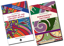
  3. Coloring book for grown ups, I self-published a Patterns of the Ancient World coloring book, available via Amazon.
Three products to assist with your projects:
  1. Slideshare is now part of LinkedIn. Post slideshows, PDFs directly to your LinkedIn profile; great for entrepreneur and business profiles.
  2. Canva: online and tablet platform to to create visuals online; tap into library of free and paid assets. 
  3. Adobe Slate new free iPad app to create visual stories quickly; might be a new method to present to clients or blog. entries.
My youngest is beginning her SENIOR year of high school... where has the time gone
Joann Sondy
Designer & Publisher
mobile: 231-633-0945
social media: @joannsondy
joannsondy.com

* Adler Planetarium, located along the Chicago shoreline, was the nation's first planetarium. Opened May 1930, designed by Ernest Grunfeld for Max Adler; the twelve zodiac bronze bas reliefs by Alphonso Ianelli grace the exterior. National Register of Historic Places and National Historic Landmark.
 

Monday, June 1, 2015

Great Cover Grabs Your Buyer's Attention


I'm diverting, briefly, from my Create Your Own Great Photo Book articles with a post about cover design.

I'm currently prepping for a keynote presentation to Chicago Self-Publishing Meet-Up group about cover design.  I've been attending this monthly meet-up, organized/managed by Kim Bookless, for the past few years. It is a community of like-minded individuals who are eager to learn and share. 


I've been invited to speak at this month about cover design. My goal is to emphasize the importance of your book's cover design and a look "behind the curtain" of how I approach cover design with you, my client.

We're not going to bad mouth lousy DIY book covers that cast a dark shadow over self-published books. (Well, at least one...for a valid reason.) I'll draw your attention to the shared characteristics of book covers within categories: format, colors, fonts and graphics.

Genres Share Cover Characteristics
These are fundamentals to understanding your target audience and how they respond the cover design. For example, it would be odd to see a sci-fi novel cover designed like a romance novel. Or a self-help book designed like a children's book. I think you get the idea.

Create [Visual] Drama

I'll also show how your cover designer will/should use graphic elements to connect the cover design to the content; adding drama. Drama could be mystery, action, movement, whimsy, or nostalgia. We'll look at a few before & after book covers to illustrate this point.

Where'd you get that image?

Image usage will also be discussed; emphasizing the importance of working with a designer who understands how to acquire and license an image properly and legally.  Downloading an image from an internet search is amateurish and you'll be disappointed by the results. There are different levels of licensing images and illustrations that you, the self-published author, NEED to understand.

Who's printing your book?

Finally, book cover design–especially for print–is highly technical. A professional designer will ask early in the creative briefing discussion, "who is printing the book?" (Red flag, if they don't!) The printer's specifications, bleed, trim, safe margin, etc. The final spine measurement is crucial. And, dimensions and placement of the ISBN bar code and pricing are necessary.

If you can't make this week's Chicago Self-Publishing Meet-Up presentation, I'll be doing follow up article, since I'm confident the group members will have plenty of questions. 

Happy self-publishing!

Thursday, May 14, 2015

Conduct Your Own Symphony, Visually

The following is an ongoing series from Create Your Own Great Photo Book. The first "Be a Ruthless Photo Editor" covers activities you can use to take control of your image library. The second, "Storyboarding, Not Just For Filmmakers," presents concepts for creating a theme for your images. 


Conduct Your Symphony, Visually

Image: Barbara Weibel (2014), http://holeinthedonut.com
Very frequently, I take a shortcut from the bus stop at Adams/Wabash through the Chicago Symphony Orchestra building to reach the Chicago Architecture Foundation, next door. If I'm lucky, I can hear the musicians in the practice rooms or the auditorium. Music, written and performed, is structured. Components that can help us structure and create our own great photo books.

By now, you've done your sequencing, injecting energy and emotion during the storyboard phase. As a designer, I use several techniques to establish a cognitive flow within a book's theme:
  • Add pauses or rests,
  • Build to crescendo,
  • Emphasis on single images, and
  • Tell a story...visually
Below are a few techniques to help you "conduct your own symphony"~visually.

PAIRINGS: Make connections. Typically, still images are static on their own but 'paired' with others the group can make a moment. 

RHYTHM/FLOW: Curate a method of how you want the reader to advance through your book. How can you tell the story visually?

RESTS/PAUSES: A blank page is NOT always the answer; in fact, it can be confusing. Use negative (white) space to balance with your photos and/or text. 

MOTIFS: Be true to the core theme or concept of the book look for colors and patterns to add interest.

TEXT: Your text should SUPPORT the images in your photo book. Refrain from using text to fill empty space. 


PRO TIP: Storyboard your book and create a mock up. This helps you envision the finished book as a singular piece, versus assembling it page-by-page.

Interested in more? Download "Create Your Own Great Photo Book."

Next: Front and back matter–important elements to create a professionally designed photo book.

Happy self publishing.

Monday, April 20, 2015

Storyboarding, Not Just for Filmmakers

The following is part of a running series of posts, from Create Your Own Great Photo Book; the first "Be a Ruthless Photo Editor" covers activities you can use to take control of your image library.

Storyboarding, Not Just for Filmmakers

How do you organize your images? Stay true to your theme.

Developing a structure based on your time is the foundation to create your own great photo book. And, keep you focused. It can be overwhelming when you're confronted with a volume of images. Refer to my previous post, Be A Ruthless Photo Editor, to eliminate the unnecessary, poor quality and non-relevant images.


A screen shot of one folder.
Example: My Family Archive. On a rainy Sunday afternoon, I decided to make a dent in scanning the negatives and photographs––which I have two or three large Rubbermaid storage tubs––from my family's photo archive. I pulled out an armful of 'stuff' and began sorting the pieces. Tossing items that had little relevance to the long-term integrity of the archive, poor quality and extremely damaged. Things like out-of-focus shots, unrecognizable subjects, generic birthday & holiday cards, etc. The result, spending time on quality pieces that would convey the story of my family.

Stay Grounded to Your Theme

As mentioned above, developing a structure will serve as your foundation. Using images and text creates your visual story. Most stories are typical: a beginning, middle and end. Let's take this further.

Tapping into a more sophisticated organization can add more interest to your photo book. Try one or a combination of the following:


4 types of story organization to add interest to your photo book.

Storyboarding your content gives you a 'roadmap' to a finish product. Naturally, we want to be flexible as the project progress. Image sequencing and storyboarding is time well spent!

After you've experimented with your visual storyboarding with your first photo book, it will become easier the next time. Eventually, challenging your creativity to try new concepts.

Interested in more? Download "Create Your Own Great Photo Book."

Next: Add cognitive flow within your theme.


Happy self publishing.

Tuesday, April 14, 2015

Great Photo Book: Be A Ruthless Photo Editor

Using as many images in your Great Photo Book maybe your first inclination; this is the absolutely wrong approach.

You MUST be a ruthless photo editor! Focus on quality over quantity.* 


Image from http://www.tokyojinja.com/
As you review your big pile (or folder) of images, ask yourself repeatedly:

  • Does the image support my theme?
  • Does it add visual interest to the message?
  • Is this image the BEST quality?

Every image selected must have purpose to the theme.

Intuition plays a huge role and powerful role. Removing your own emotions from your review process will allow you focus on quality and the image(s) contribution to your book.

Conduct research at the library and/or local bookstore, I find used bookstores have fabulous stacks of photo books. Observe the sequencing of images and how each leads you through a process of the visual story. What story are your images telling?

* Select images that express concepts and support the main story or theme of the book. 


An introduction to self-publishing techniques to create your own amazing book using your photographs or illustrations.

Create Your Own Great Photo Books cover
Download Free eBook 
Discover techniques to create and publish of your own photo book, plus an introduction to self-publishing options (print and digital formats). Ideal for photographers, illustrators, architects, chefs, historians and many more.

Topics covered:
Image Sequencing & Storyboarding
Page Layout and Structure
Cover Design
Image Preparation
Overview: Shutterfly, Lulu and Blurb


Monday, April 6, 2015

Create Your Own Great Photo Book

Create Your Own Great Photo Books

  • Have you ever wanted to create your own photo books?
  • How do you start?
  • What are techniques to make it look professional?
  • How do I get it printed?
Create Your Own Great Photo Books cover
Download Free eBook 
Just released a few days ago to select list of followers, now available for you.

An introduction to self-publishing techniques to create your own amazing book using your photographs or illustrations.

Discover techniques to create and publish of your own photo book, plus an introduction to self-publishing options (print and digital formats). Ideal for photographers, illustrators, architects, chefs, historians and many more.

Topics covered:
  • Image Sequencing & Storyboarding
  • Page Layout and Structure
  • Cover Design
  • Image Preparation
  • Overview: Shutterfly, Lulu and Blurb


* eBook format is 21-page PDF, compatible on desktop and mobile devices.
Read Privacy Policy

Thursday, March 5, 2015

Dancing In The Dark

Wow, it's been a couple of months since I've posted anything new for you.  Frankly, I've been immersed in some very exciting projects.

Don't let the title of this post send you looking for Bruce Springsteen on iTunes. 

Can you deliver your speech/presentation in the dark? 

Without the support of visual aids? Ditch the PPT?

Image courtesy Choose Chicago
Many of you know that I'm a docent with the Chicago Architecture Foundation, and this year I'm 'sponsoring' a trainee. One of my responsibilities is a walk through or demonstration of one of the core tours. 

Due to scheduling, my trainee and I could only agree to meet after work. This is Chicago, it's dark by 6 p.m. and this week it's been cold (again) and damp. Not the best conditions to display my expertise. 

Midway through the two-hour tour, Ben, docent-in-training, complimented me on the descriptive speech I used to describe details of buildings on the Chicago Old & New Tour.

After I thanked him, I was surprised when I realized that the darkness added a new and highly disciplinary behavior to my tour. A way to reduce and eliminate some bad behaviors and crutches. 

I wasn't relying on the illumination of daytime, as I usually do. Instead, recalling specific details expressed with highly descriptive language. Clearly articulating the core concepts, coherently making comparisons to describe details that are seen vividly during the day.

Plan B–No Crutches
This exercise recalled the disastrous and feeble attempts I've witnessed over the years when technology fails. You know what I'm talking about: microphone cut outs, the presentation file doesn't load, the computer shuts down, the projector lamp burns out, you don't have the right cable, its the wrong file/version, etcetera, etcetera.

A Challenge
I challenge you to deliver your speech or presentation without the use of visual aids. Take it further and step away from the lectern and turn off the microphone. 

Can you express the core message(s) and support it with details to your audience coherently? Delivered with passion and confidence? 

Here's the link to your 80s rock-n-roll fix, "Dancing in the Dark" by Bruce Springsteen.